Introduction
Why does choosing a product online sometimes feel harder than it should be? You open a product page. You like the item. You’re almost ready to buy. Then you see the options. A dropdown. Another dropdown. Tiny text labels. No images. No clues. You pause. That pause is dangerous.
In eCommerce, hesitation is the space where conversions die quietly. And most of the time, it’s not because users don’t want the product. It’s because the interface made them think too much.
Visual product swatches exist to solve that exact moment. They don’t scream for attention. They don’t demand effort. They show the choice. Instantly. And that small shift changes everything from how users feel to how often they buy.
This article explores how visual product swatches impact user experience and conversion rates, not in theory, but in practice—the subtle psychology. The quiet design wins. And why something so small can make such a measurable difference.
Understanding Visual Product Swatches
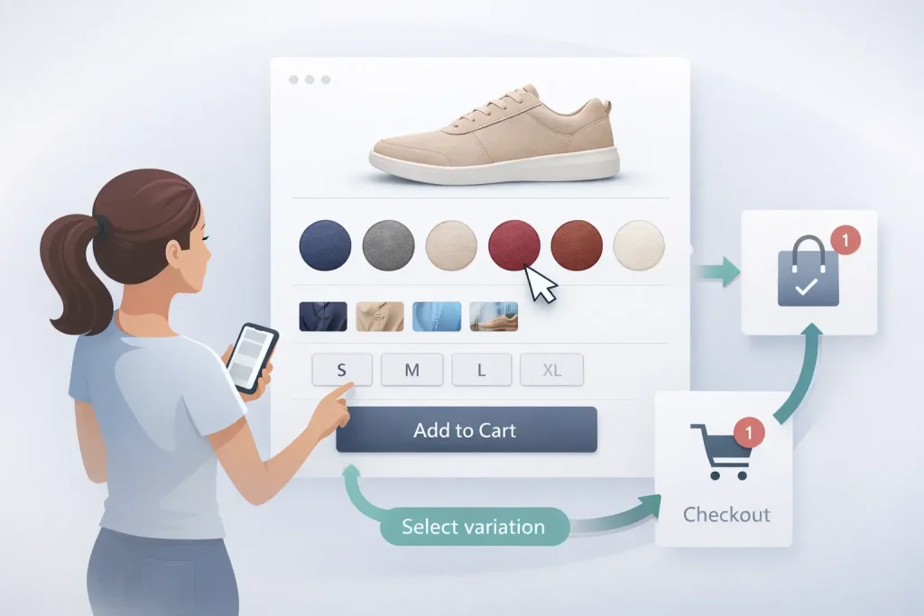
Visual product swatches are choices made visible. Instead of asking users to read and imagine, swatches let them see. Color. Texture. Pattern. Style. All at once.
They replace abstract labels with concrete visuals. A blue square instead of “Navy Blue.” A fabric thumbnail instead of “Cotton Blend.” A real preview instead of a guess.
That matters more than it sounds. Because online shopping already asks users to trust too much. The product isn’t in their hands. The lighting is controlled. The photos are curated. Anything that removes uncertainty helps. Swatches don’t explain. They reveal. And users respond to that instinctively.
Why Traditional Dropdowns Create Friction
Dropdowns are efficient. Technically. But emotionally? They’re cold. When a user sees a dropdown, they know work is coming. Click. Read. Interpret. Decide. Click again. Hope it was the right choice. It’s a tiny burden. But repeated often.
Dropdowns also hide information. You don’t know how many options exist until you open them. You can’t compare easily. And on mobile, they feel especially clumsy.
One wrong tap. One misread option. One moment of doubt. Visual swatches remove those micro-frictions. They don’t ask users to imagine outcomes. They show them. And showing always feels easier than guessing.
UX Psychology Behind Visual Swatches
Humans Process Visuals Faster Than Text
The brain loves shortcuts. Visual ones especially. A color swatch is processed almost instantly. No translation required. No internal rendering. Just recognition. Text, on the other hand, requires interpretation. “Charcoal Gray” could mean five different things depending on the screen, the lighting, or the brand.
When you show instead of tell, you reduce effort. And reduced effort feels good. Good UX often feels invisible. Swatches achieve that by aligning with how people naturally think and decide.
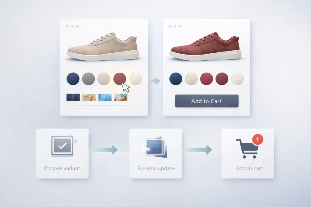
Swatches Increase Perceived Control
There’s a subtle emotional shift when users click a swatch, and the product image changes immediately. They feel in control. Their action did something. It had a result. The interface responded.
That feedback loop builds trust. Not logically. Emotionally. Users don’t think that this interface is well-designed. They think, this feels easy. And ease is persuasive.
Reduced Anxiety Leads to Better Decisions
Uncertainty is uncomfortable. When users aren’t sure what they’re choosing, they hesitate. They scroll more. They leave tabs open. They delay decisions. Visual swatches reduce that anxiety. They make choices concrete. They answer questions before users even realize they had them.
- What does it look like?
- How different is this option?
- Will I like it?
Seeing removes doubt. And doubt is expensive in eCommerce.
Visual Swatches and Conversion Rates
Faster Decisions, Higher Completion Rates
When choices are obvious, decisions come faster. Users don’t stop to decode options. They don’t scroll back up to double-check. They don’t second-guess as much. They choose. And they move forward.
Stores that replace dropdowns with visual swatches often see improved add-to-cart rates, especially on variable products. Not because swatches are flashy. But because they remove friction. Buying feels smoother. Less interrupted. And smooth experiences convert better. Almost always.
Improved Mobile Conversions
Mobile shopping changes everything. Screens are smaller. Attention is fragmented. Fingers are less precise than cursors. Dropdowns struggle here. They take over the screen. They break the flow. They demand focus.
Visual swatches fit naturally into mobile layouts. They’re tappable. Scannable. Comfortable. Big enough to hit. Clear enough to understand. For mobile-first users, swatches don’t feel like an upgrade. They feel expected.
Clearer Expectations Reduce Returns
Returns hurt. Financially and emotionally. Often, returns happen because the product didn’t match what the customer imagined. The color felt off. The finish looked different. The style wasn’t what they expected.
Visual swatches reduce this gap between expectation and reality. They set a clearer mental picture before purchase. And when customers get what they expected, they’re less likely to send it back.
Types of Visual Product Swatches
Color Swatches
Color swatches are the most familiar form. And for good reason. Color swatches for WooCommerce work. Instead of reading color names, users see actual hues. They compare instantly. They choose confidently.
Image-Based Swatches
Sometimes color isn’t enough. Patterns. Textures. Materials. These need more context. Image-based swatches show small thumbnails of the actual variation. Not an abstract color block. A real preview. They’re especially effective for fashion, home décor, and lifestyle products where details matter.
Text + Visual Hybrid Swatches
Some products need explanation alongside visuals. Sizes. Capacities. Formats. Hybrid swatches combine text with visual styling, offering clarity without sacrificing usability. They feel structured but still friendly.

Visual Swatches as a Branding Tool
Swatches communicate more than choice. They communicate taste. Rounded swatches feel softer. Minimal ones think premium. Bold colors think playful. Muted palettes feel refined. Spacing matters. Animation matters. Hover states matter.
When swatches align with brand identity, the entire shopping experience feels intentional—thought through. Polished. Inconsistent or poorly styled swatches break that illusion. They feel cheap. Rushed. Untrustworthy. Design details matter most when users don’t consciously notice them.
Role of Swatches in Product Discovery
Swatches don’t only live on product pages. When used in product listings, they turn browsing into interaction. Users explore without committing. They preview variations without clicking through.
This keeps them engaged longer. Encourages comparison. Reduces pogo-sticking between pages. Discovery becomes playful. Curious. Less exhausting. And that emotional shift matters more than metrics sometimes suggest.
Accessibility Considerations
Visual doesn’t mean exclusion. Good swatch design considers everyone. Keyboard users. Screen readers. Users with color vision differences. Clear focus states. Sufficient contrast. Descriptive labels. Accessibility doesn’t dilute design. It sharpens it. When choices are clear to everyone, the experience improves for everyone.
Performance and Technical Considerations
Visual enhancements must stay lightweight. Heavy images. Poorly optimized scripts. Excessive animations. These things slow pages down. And slow pages kill conversions. Well-built swatches load fast. Respond instantly. Feel seamless. Tools like product swatches for WooCommerce are often built with performance in mind, ensuring visual upgrades don’t come with technical debt.
Speed is invisible until it’s gone. Then it’s all the users notice.
Measuring the Impact of Visual Swatches
The impact shows up quietly. Higher add-to-cart rates. Longer session times. Lower bounce rates. Fewer returns. A/B testing often reveals that visual swatches outperform dropdowns, especially on mobile and visually driven products. Sometimes the smallest UI changes deliver the biggest gains.
Conclusion
Visual product swatches don’t transform stores overnight. They don’t guarantee success. They don’t replace good products or honest pricing. But they remove friction. They reduce hesitation. They make shopping feel easier. And in eCommerce, ease is powerful. When users don’t have to think as much, they trust more. When they trust more, they buy more. Visual swatches work not because they’re trendy, but because they respect how people actually shop. Quickly. Visually. Imperfectly. And sometimes, that’s all it takes.
Frequently Asked Questions
1. What are visual product swatches in eCommerce?
Visual product swatches are clickable option selectors that show a variation visually instead of using a dropdown menu. They typically appear as color circles, squares, thumbnails, or styled text buttons, helping shoppers choose product variations faster and with more confidence.
2. Are visual swatches better than dropdowns for product variations?
In most cases, yes. Visual swatches reduce friction because users don’t need to open menus, read labels, and imagine the result. Instead, they instantly see the options and choose with less effort, which often leads to higher add-to-cart rates and fewer abandoned product pages.
3. Do product swatches increase conversion rates?
They can. Swatches reduce hesitation by making choices clearer and quicker. When shoppers feel more confident about what they’re selecting, they move forward faster, leading to improved add-to-cart actions and higher checkout completion rates, especially for visually driven products.
4. Why do visual swatches improve user experience (UX)?
Visual swatches improve UX because they match how people naturally browse and decide online: visually, quickly, and with minimal effort. Instead of translating text labels into mental images, users see the variation immediately, which makes the product page feel more intuitive and less demanding.
5. Do visual product swatches reduce product returns?
They can help reduce returns by setting clearer expectations before purchase. When shoppers can better understand color, texture, or style differences during selection, they’re less likely to feel surprised when the product arrives, which reduces the mismatch between expectation and reality.
6. Are visual swatches better for mobile shopping?
Yes, especially compared to dropdowns. Dropdowns can feel clumsy on mobile screens and often interrupt the browsing flow. Swatches are easier to scan and tap, making variation selection smoother, faster, and more comfortable for mobile-first shoppers.
7. What types of products benefit most from visual swatches?
Visual swatches work best for products where looks matter most, like fashion, beauty shades, home decor patterns, furniture fabrics, and accessories. When customers can see the difference instantly, they choose faster and buy with more confidence.
8. How do I test whether visual swatches improve performance in my store?
Run an A/B test by comparing dropdowns vs. swatches on the same product pages. Track add-to-cart rate, conversion rate, bounce rate, and time on page to see which option drives better results.